Bed in a Box
Student ProjectGraphic Design
Austin Woodward
Bed in a Box is a brand identity that emerged from a rigorous logo development practice in Typographic Systems I, where I was tasked with creating a multitude of logos for various unserved brands. Amidst the creative process, I became captivated by the concept of sleep and chose Bed in a Box to fully develop into a unique brand identity.
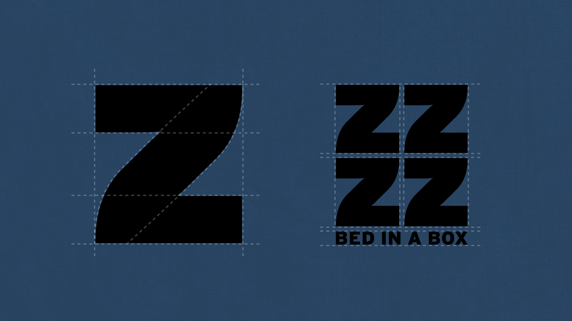
Inspired by the onomatopoeia of sleep, the logo is crafted from the iconic and universally recognizable ZZZZ, providing a fun and innovative perspective. To reinforce the brand's identity and visually identify with the entire sleep process, the color palette was thoughtfully curated to evoke the feeling of falling asleep.
In selecting typefaces for the brand identity, I intentionally chose Interstate Black and Tommy Soft, which embody the extremes of sleep. Interstate Black's bold and rigid appearance reflects the strength and power sleep can bring, and perhaps the frustration of not being able to, while Tommy Soft's smooth and curved design symbolizes the gentle and calming nature of rest. Together, these two elements work in harmony to help explore guiding people to a peaceful slumber.
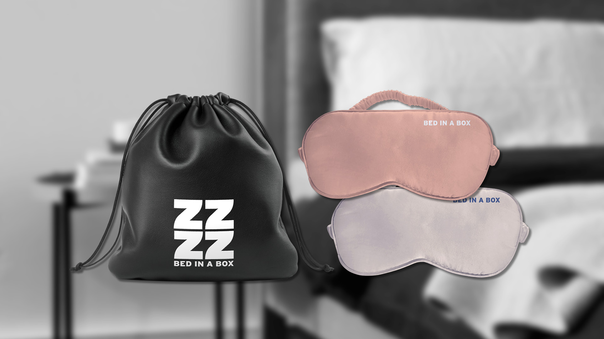
To further develop the brand, I explored various ephemera, including a business card, letterhead, sleep care package, and delivery van, to express the simple idea of Bed in a Box across a range of materials. This creative journey was an exciting challenge, and I enjoyed the process of translating the brand identity into a comprehensive and cohesive visual system.
I invite you to scroll below to see my brand identity pitch deck, and explore my process in creating the logo.
![]()
![]()
![]()
![]()
![]()
![]()
Inspired by the onomatopoeia of sleep, the logo is crafted from the iconic and universally recognizable ZZZZ, providing a fun and innovative perspective. To reinforce the brand's identity and visually identify with the entire sleep process, the color palette was thoughtfully curated to evoke the feeling of falling asleep.
In selecting typefaces for the brand identity, I intentionally chose Interstate Black and Tommy Soft, which embody the extremes of sleep. Interstate Black's bold and rigid appearance reflects the strength and power sleep can bring, and perhaps the frustration of not being able to, while Tommy Soft's smooth and curved design symbolizes the gentle and calming nature of rest. Together, these two elements work in harmony to help explore guiding people to a peaceful slumber.
To further develop the brand, I explored various ephemera, including a business card, letterhead, sleep care package, and delivery van, to express the simple idea of Bed in a Box across a range of materials. This creative journey was an exciting challenge, and I enjoyed the process of translating the brand identity into a comprehensive and cohesive visual system.
I invite you to scroll below to see my brand identity pitch deck, and explore my process in creating the logo.


