Distributed Proximities
Student ProjectGraphic Design
Austin WoodwardDuring my time in Advanced Typography II at the University of Arkansas, I undertook the challenge of rebranding Distributed Proximities, an annual tech-centered symposium that had gone fully digital due to the COVID-19 pandemic. My challenge in this re-brand was how to leverage this new digital platform and users’ screens to the brands advantage, while focusing on fostering a sense of community for speakers and viewers.
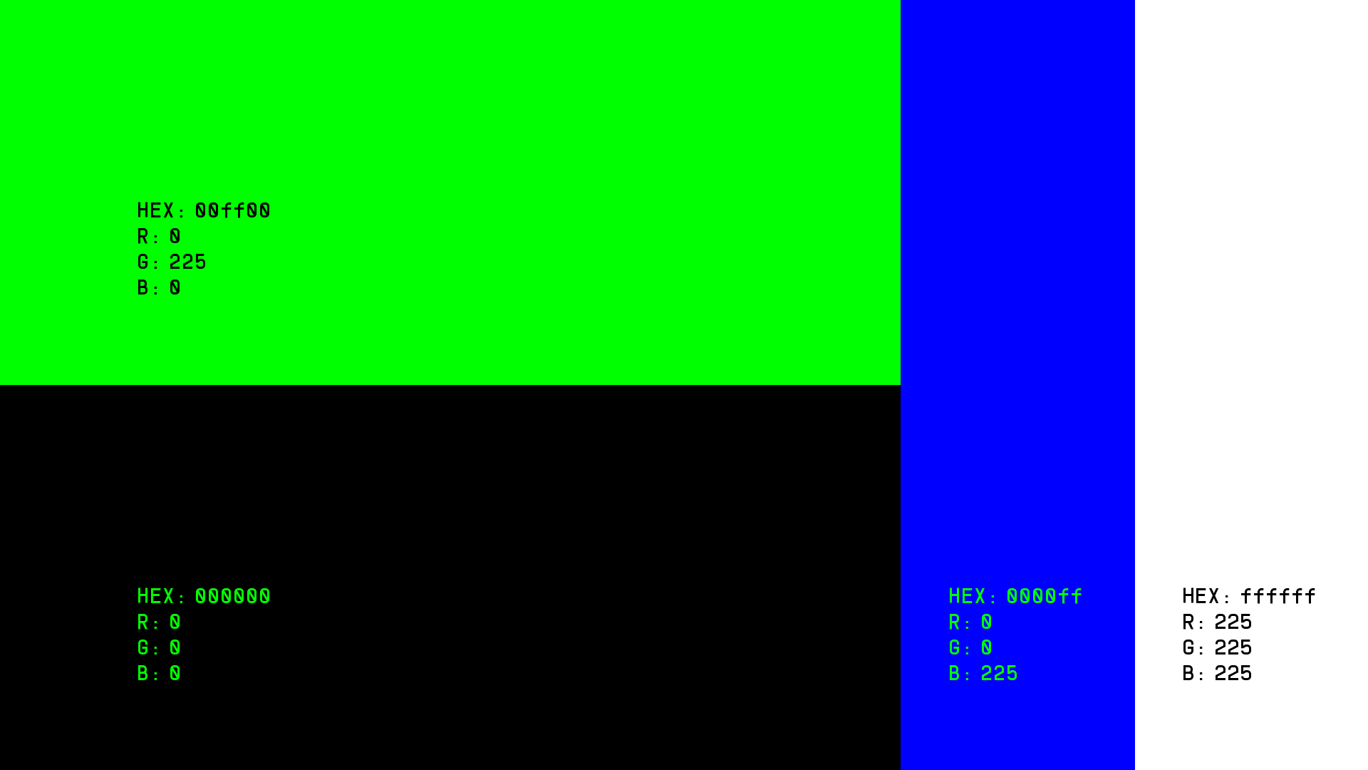
To achieve this, I conducted extensive research on past event branding, previous speakers, and various digital processes. This led me to the decision to start with a color pallete. I chose classic RGB to nod to familiar coding colors, and the restrictions of vintage screens.
For the primary typeface, I found Serous by Formist Foundry. This modular typeface is defined by its interlocking nature and was inspired by rhythm and fluidity, much like electricity coursing through a motherboard. To increase legibility, and contrast with Serous, I chose Supply by Pangram Pangram – a hyper legible font nodding to vintage digital number displays.
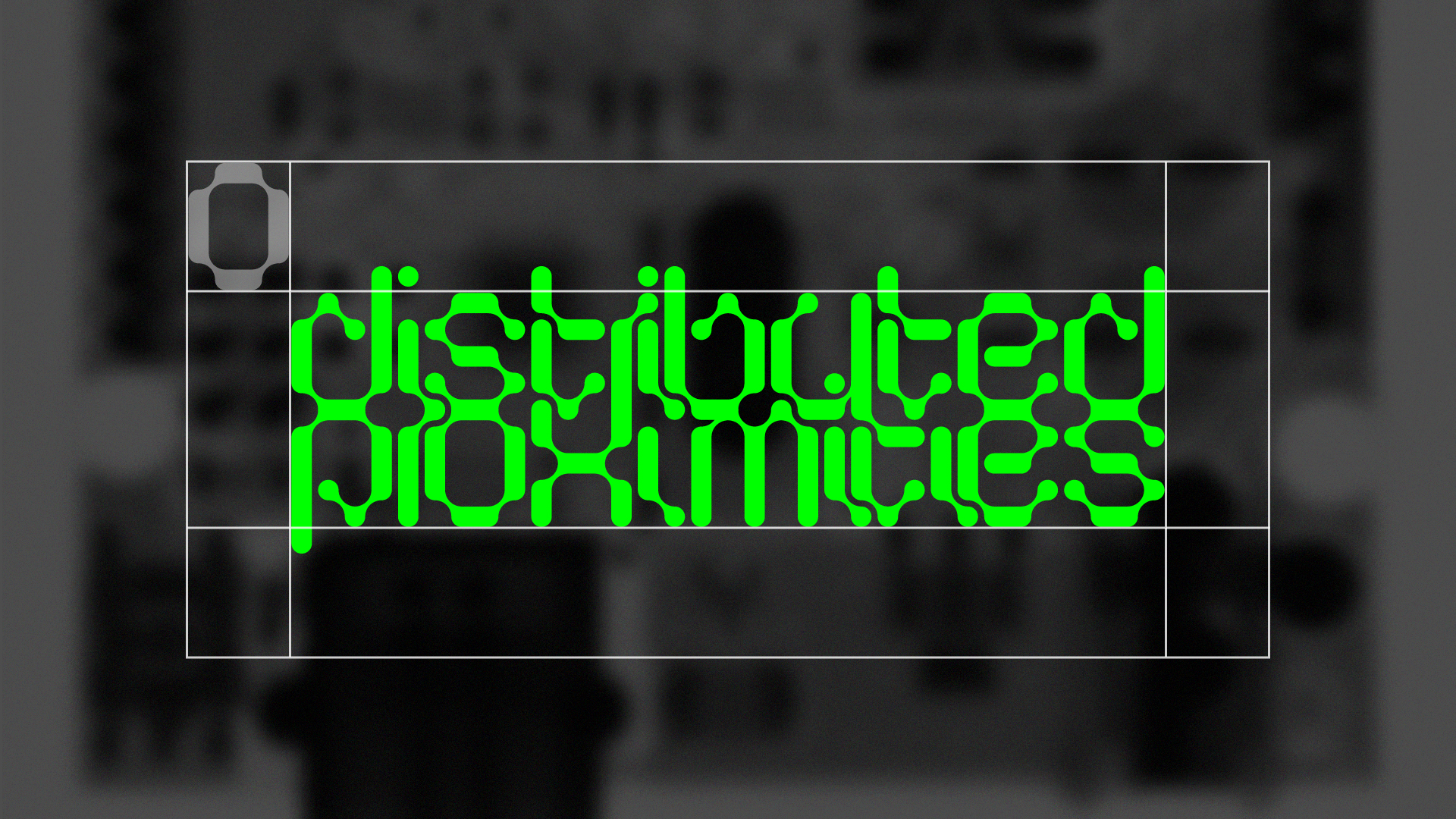
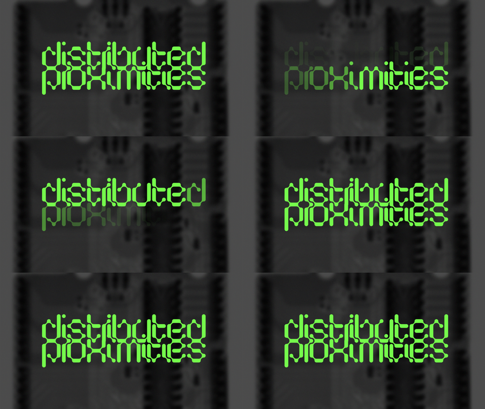
Using Serous, I created the main mark for Distributed Proximities, which allowed the characters to overlap, symbolizing the need for connections in motherboard designs, and human nature. I then undertook animating the mark in After Effects, to enhance legibility by introducing each letter individually in a quick dance.
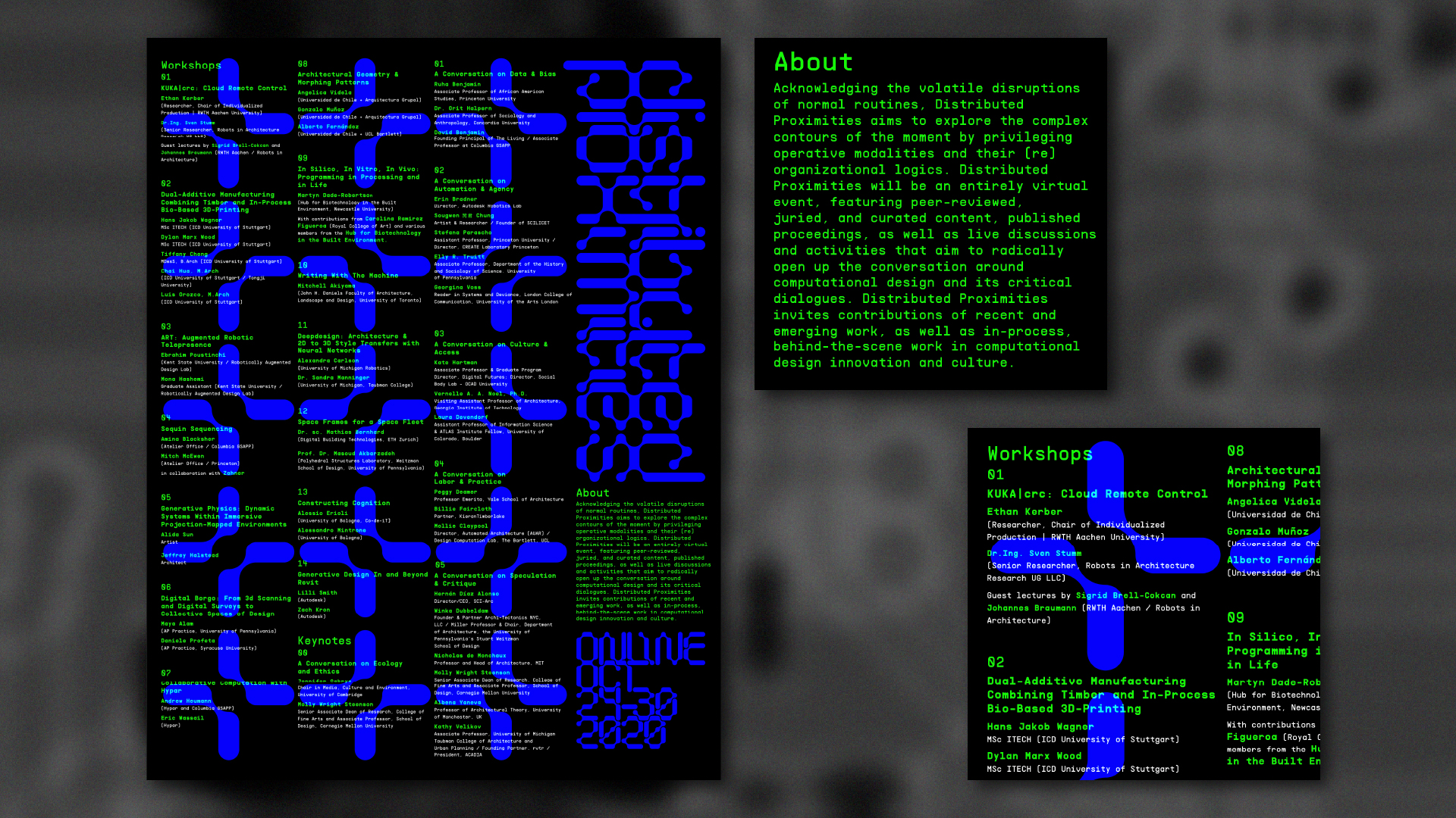
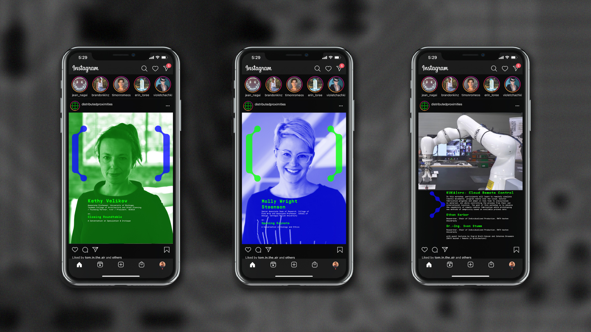
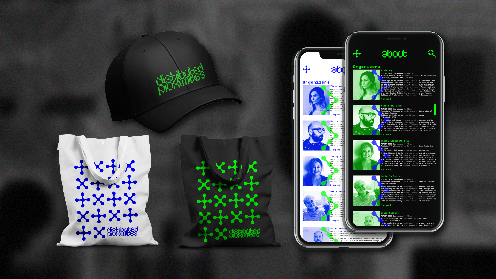
The project resulted in a range of digital and print materials, including an app showcasing the speakers, and social media content to gather support. To maintain a sense of community despite the digital platform, I then created physical materials such as a broadside poster, a hat, and a carrying bag.
I invite you to scroll down and view my pitch deck, and miniature brand guide.
![]()
![]()
![]()
![]()
![]()
![]()
To achieve this, I conducted extensive research on past event branding, previous speakers, and various digital processes. This led me to the decision to start with a color pallete. I chose classic RGB to nod to familiar coding colors, and the restrictions of vintage screens.
For the primary typeface, I found Serous by Formist Foundry. This modular typeface is defined by its interlocking nature and was inspired by rhythm and fluidity, much like electricity coursing through a motherboard. To increase legibility, and contrast with Serous, I chose Supply by Pangram Pangram – a hyper legible font nodding to vintage digital number displays.
Using Serous, I created the main mark for Distributed Proximities, which allowed the characters to overlap, symbolizing the need for connections in motherboard designs, and human nature. I then undertook animating the mark in After Effects, to enhance legibility by introducing each letter individually in a quick dance.
The project resulted in a range of digital and print materials, including an app showcasing the speakers, and social media content to gather support. To maintain a sense of community despite the digital platform, I then created physical materials such as a broadside poster, a hat, and a carrying bag.
I invite you to scroll down and view my pitch deck, and miniature brand guide.
