Kitao Skincare
Student ProjectGraphic Design
Austin Woodward
Kitao is a Kyoto-based skin care company that prides itself on using locally sourced ingredients. As a fan of the brand, I aimed to redesign their graphic identity and packaging with a focus on sustainability and the ceremonial aspects of green tea.
During my research, I found that Kyoto's green tea farmers faced the challenge of making their ceremonial products relevant to younger generations, who are less interested in traditional crafts due to the rise of technology and necessity of working in large cities. To combat this, they began offering luxury taste testing experiences that showcased the variety of flavors that carefully aged green tea can produce, providing a peaceful retreat for younger generations and experience worth leaving cities for.
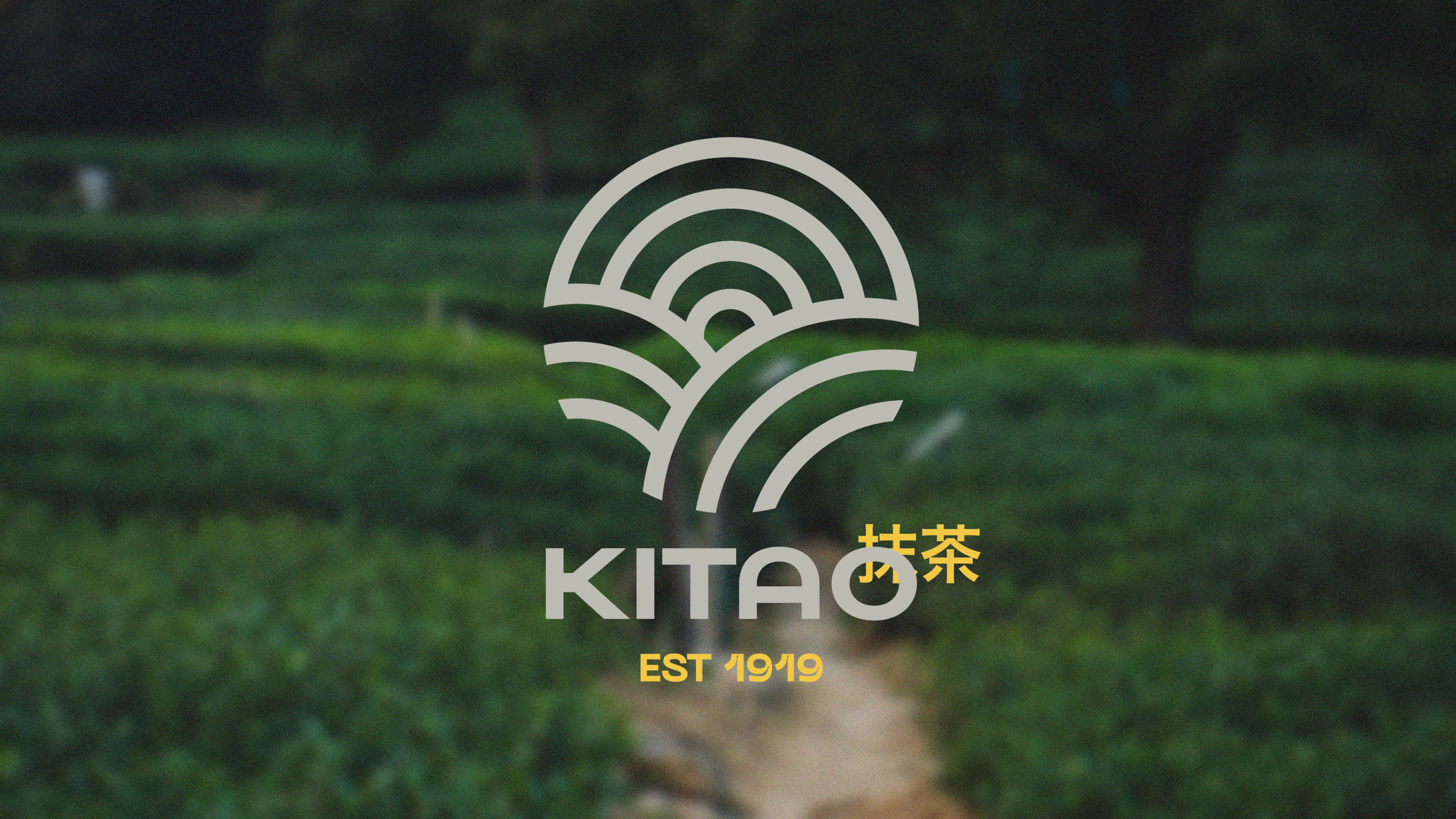
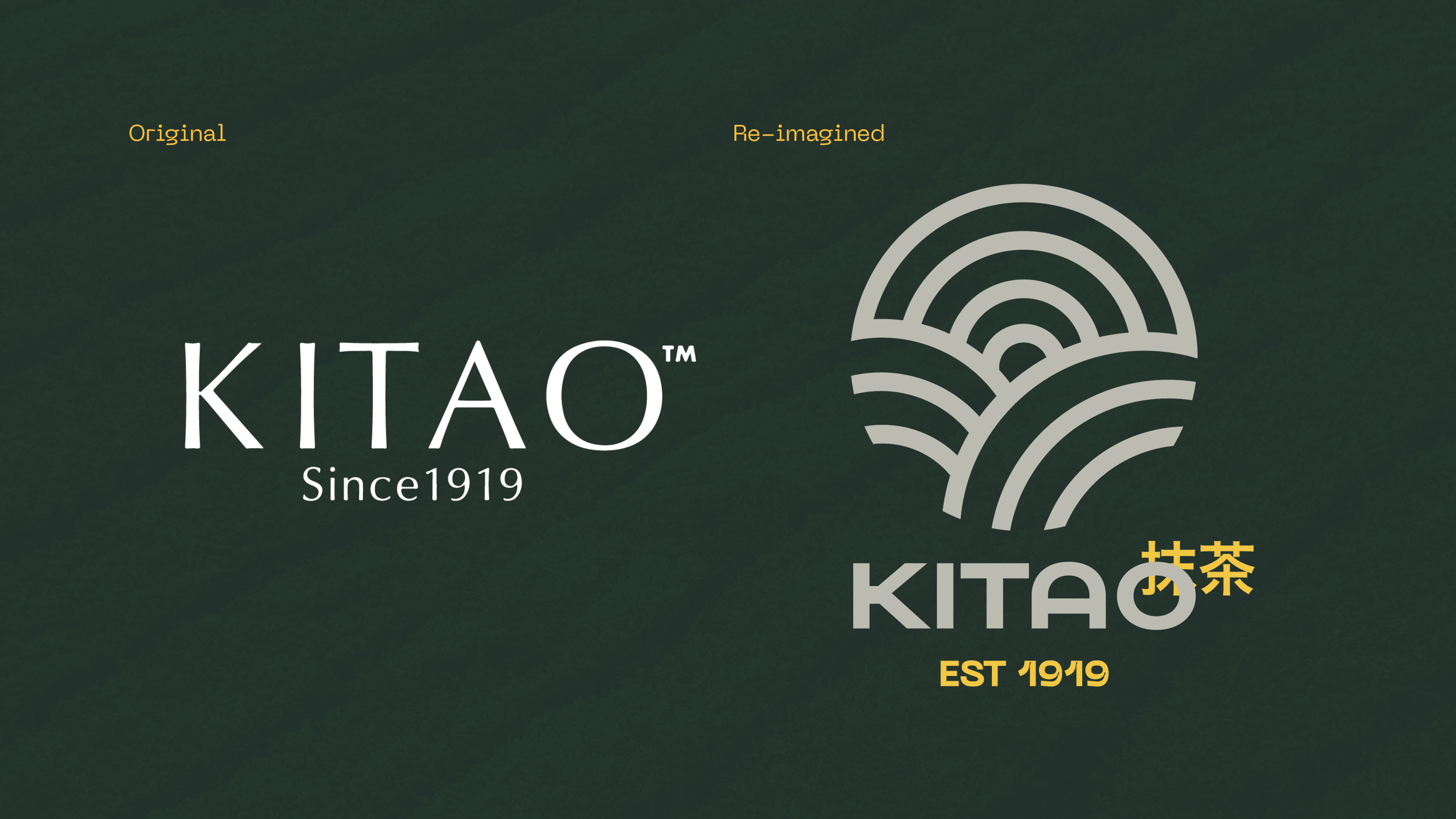
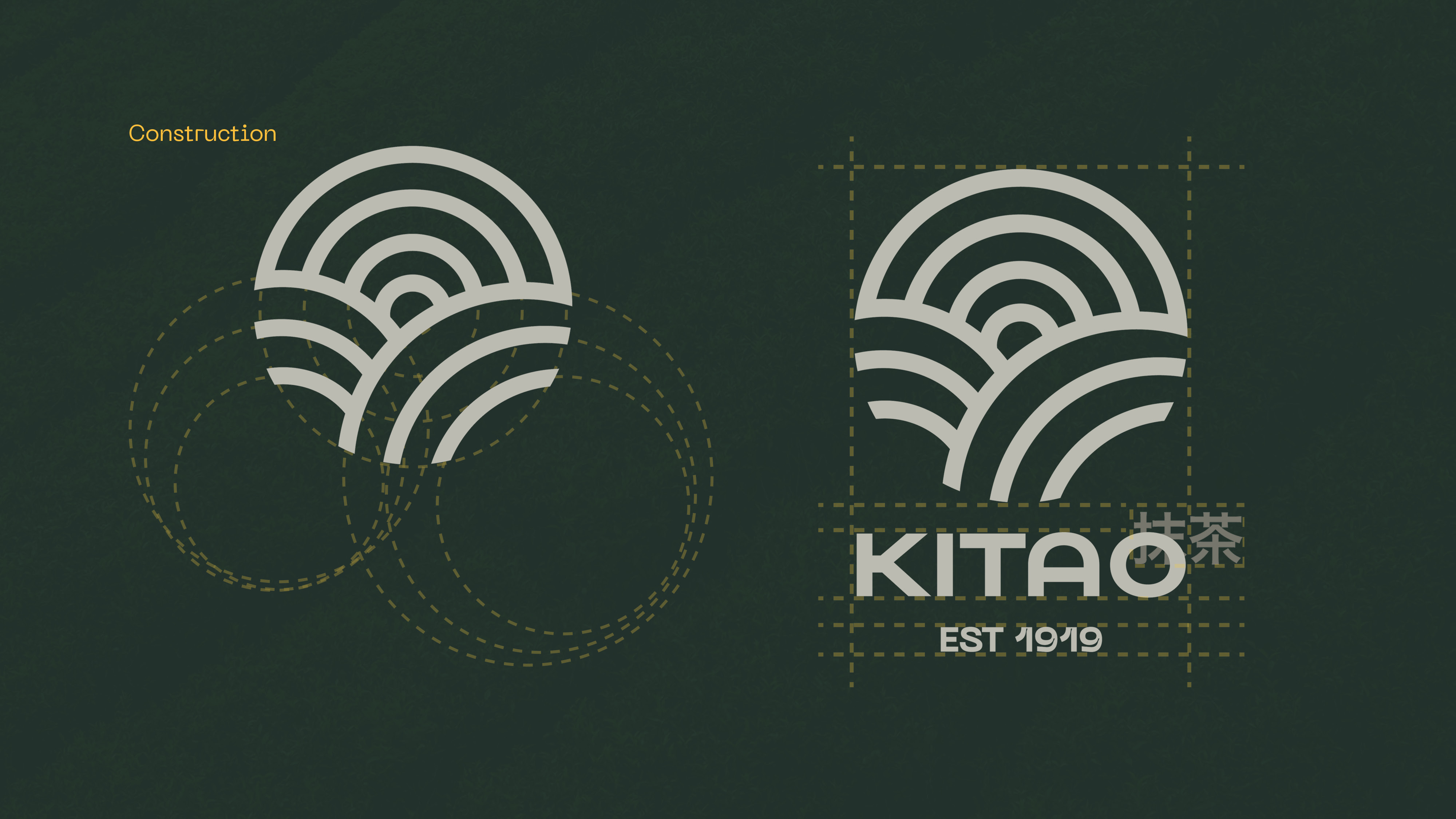
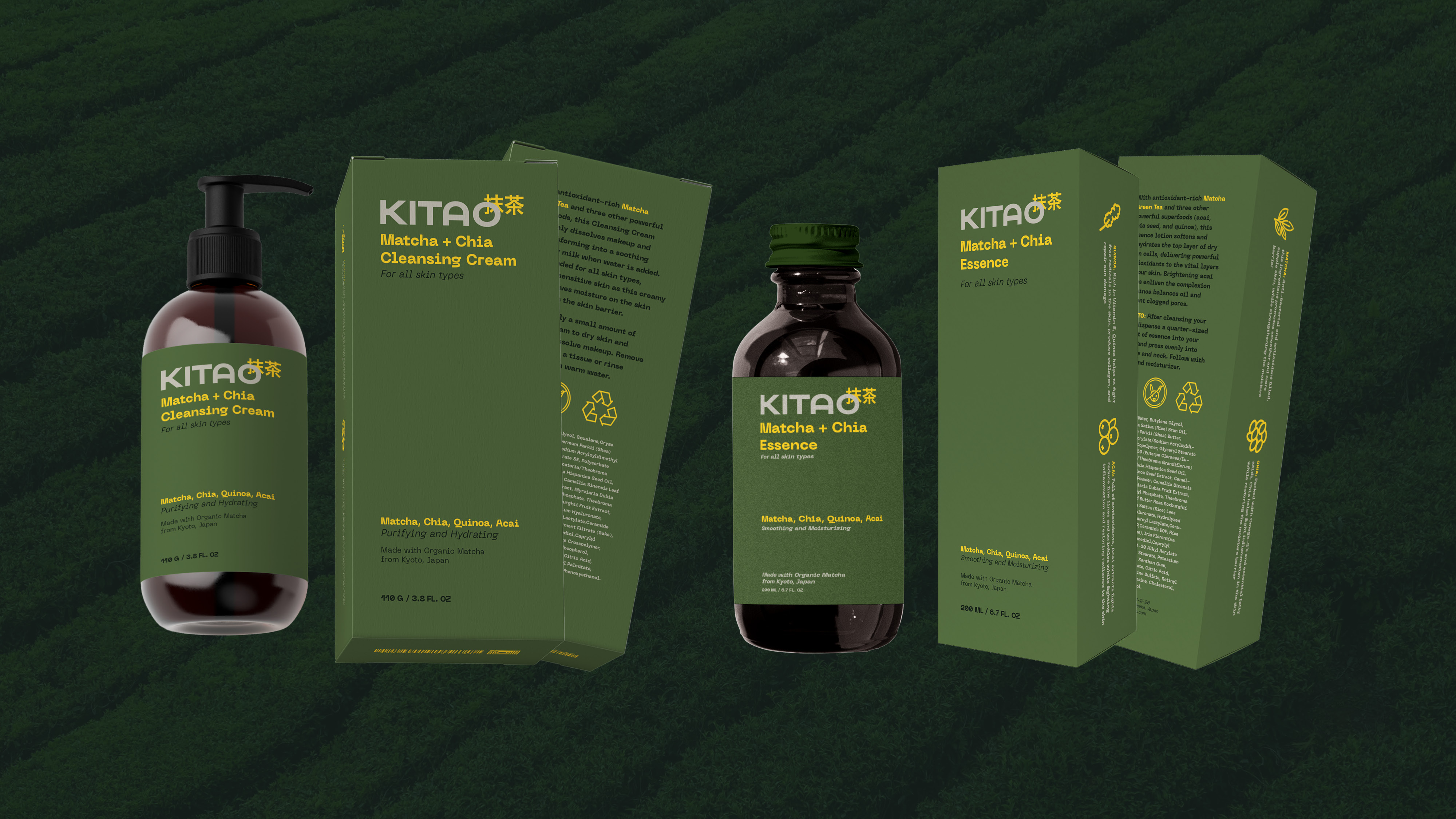
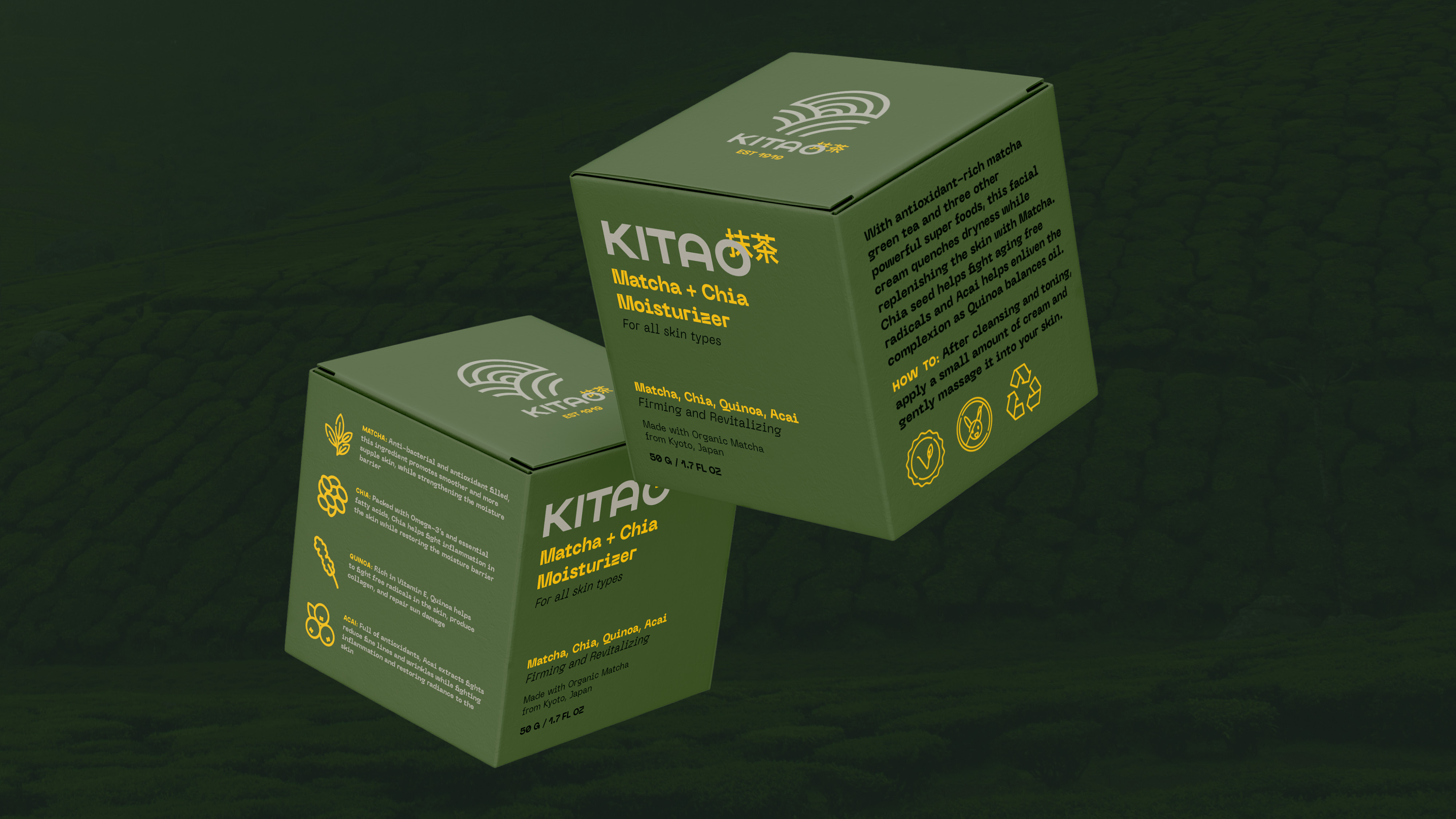
Inspired by this research, I incorporated the rolling hills of green tea cultivation into Kitao's brand identity through my mark. Bright, vivid packaging was used to help the brand stand out on shelves, with green as the primary color to reflect the star ingredient, and yellow used for contrast and legibility. Few beauty competitors take this approach, instead opting to use clean and white packaging to suggest luxury, allowing Kitao to shine. This color palette strategically allows Kitao to expand its product range by using the color of its key ingredients in future product offerings.
To mirror younger generations fashion trends, the unique and bold typeface Soya by Good Type Foundary was chosen and paired with Neue Machina by PangramPangram for legibility across digital and print channels. This combination capitalizes upon influencer marketing, allowing consumers to feel reflected in Kitao’s product and offering a brand identity that makes skincare fun, and generates buzz, allowing Kitao to capitalize on brand recognition and word-of-mouth marketing.
In keeping with Kitao’s commitment to sustainability, I opted for recycled paper packaging and glass containers for all products. This choice promotes proper recycling practices at the end of its life and offers the ability for the brand to offer discounts to returning customers who show their used packages.
By researching and incorporating historic detail and local ingredients, Kitao’s revamped brand identity and packaging solutions help the brand stand out amongst global beauty competitors, by staying true to its brands origins and honest connection with Kyoto’s traditional craft of green tea.
![]()
![]()
![]()
![]()
![]()
![]()
![]()
![]()
During my research, I found that Kyoto's green tea farmers faced the challenge of making their ceremonial products relevant to younger generations, who are less interested in traditional crafts due to the rise of technology and necessity of working in large cities. To combat this, they began offering luxury taste testing experiences that showcased the variety of flavors that carefully aged green tea can produce, providing a peaceful retreat for younger generations and experience worth leaving cities for.
Inspired by this research, I incorporated the rolling hills of green tea cultivation into Kitao's brand identity through my mark. Bright, vivid packaging was used to help the brand stand out on shelves, with green as the primary color to reflect the star ingredient, and yellow used for contrast and legibility. Few beauty competitors take this approach, instead opting to use clean and white packaging to suggest luxury, allowing Kitao to shine. This color palette strategically allows Kitao to expand its product range by using the color of its key ingredients in future product offerings.
To mirror younger generations fashion trends, the unique and bold typeface Soya by Good Type Foundary was chosen and paired with Neue Machina by PangramPangram for legibility across digital and print channels. This combination capitalizes upon influencer marketing, allowing consumers to feel reflected in Kitao’s product and offering a brand identity that makes skincare fun, and generates buzz, allowing Kitao to capitalize on brand recognition and word-of-mouth marketing.
In keeping with Kitao’s commitment to sustainability, I opted for recycled paper packaging and glass containers for all products. This choice promotes proper recycling practices at the end of its life and offers the ability for the brand to offer discounts to returning customers who show their used packages.
By researching and incorporating historic detail and local ingredients, Kitao’s revamped brand identity and packaging solutions help the brand stand out amongst global beauty competitors, by staying true to its brands origins and honest connection with Kyoto’s traditional craft of green tea.