Product Launch Campaign
Graphic Design
Austin WoodwardCopy Writer
Kendra BandyContent Manager, Field Agent
Stakeholder
Patricia RothmeyerSocial Media Manager, Field Agent
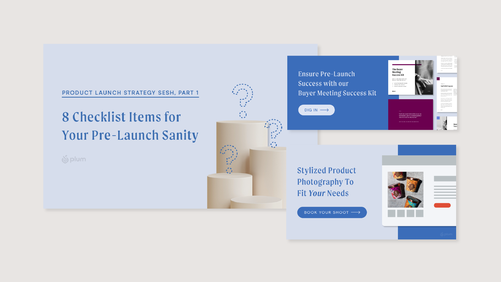
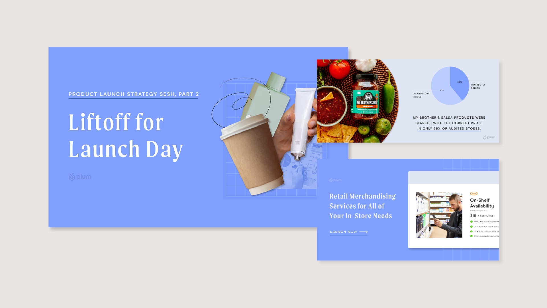
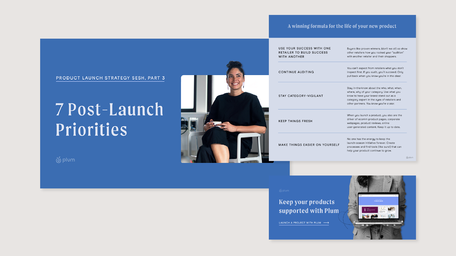
As a member of Field Agent's strategic marketing team, I was tasked with creating a visually compelling guide to the product launch process that targeted business owners. Working in collaboration with Kendra Bandy and her excellent copywriting, our team aimed to highlight Field Agent's products as a vital resource for every phase of the launch process. To achieve this goal, we produced three blog posts, a large eBook, a pillar market page, and a product launch checklist.
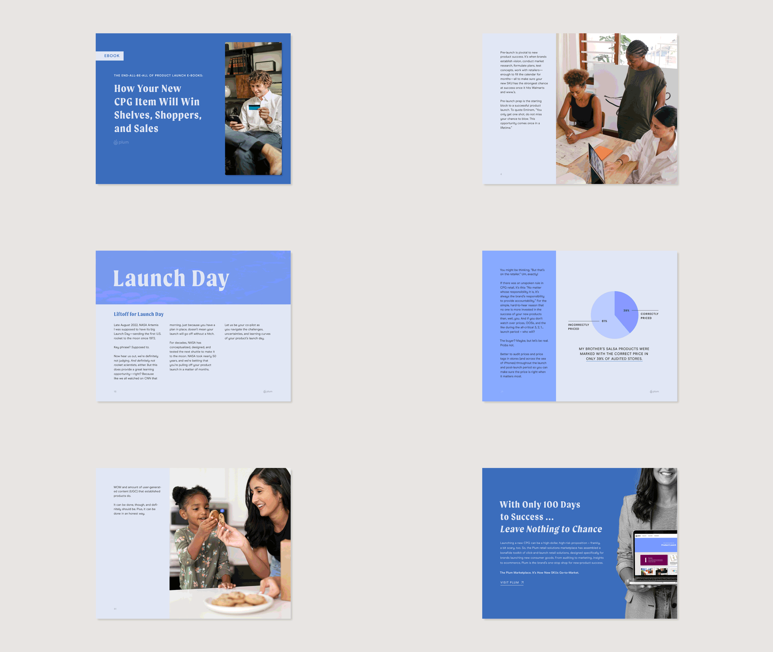
My creative approach involved using a multi-shaded design that employed different shades of the Plum Marketplace blue color palette, creating a cascading effect in the blog posts that progressed from lightest to darkest. This ensured a cohesive and easy-to-follow visual guide for readers, with each step of the launch process color-coded in a distinctive shade. This was first executed on the blog posts, following a three week launch for each blog.
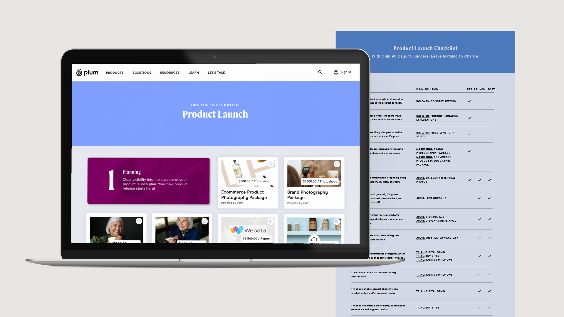
The eBook followed the same cascading color code, with each chapter strategically leveraging this design element to create a visual identity for the campaign connecting back to each blog post. The landing page was designed to complement both the eBook and blog posts, which featuring links to comprehensive product pages on Plum Marketplace. This seamless integration helped to drive traffic to the site and promote Field Agent's range of products, resulting in a significant increase in views.
Overall, this creative approach delivered a visually appealing and user-friendly guide to the product launch process, with a consistent and distinctive visual identity that effectively highlighted Field Agent's products as an essential resource for business owners.
![]()
![]()
![]()
![]()
My creative approach involved using a multi-shaded design that employed different shades of the Plum Marketplace blue color palette, creating a cascading effect in the blog posts that progressed from lightest to darkest. This ensured a cohesive and easy-to-follow visual guide for readers, with each step of the launch process color-coded in a distinctive shade. This was first executed on the blog posts, following a three week launch for each blog.
The eBook followed the same cascading color code, with each chapter strategically leveraging this design element to create a visual identity for the campaign connecting back to each blog post. The landing page was designed to complement both the eBook and blog posts, which featuring links to comprehensive product pages on Plum Marketplace. This seamless integration helped to drive traffic to the site and promote Field Agent's range of products, resulting in a significant increase in views.
Overall, this creative approach delivered a visually appealing and user-friendly guide to the product launch process, with a consistent and distinctive visual identity that effectively highlighted Field Agent's products as an essential resource for business owners.
